Index
Design and Build Quality
If you’re a fashionista, you probably won’t be impressed by the conservative design of the K3 Note. It’s simple and utilitarian.
There’s no brushed aluminium, CNC-milled stainless steel or any fancy materials – just good old plastic and polycarbonate.
Three colour options are available: White, Black and Yellow (lemon yellow to be precise). As you can see, we got a white sample, and to be honest, we think it looks better than the other two.
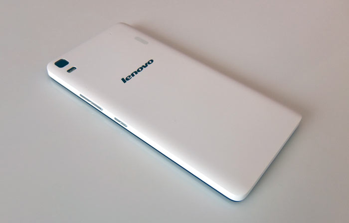
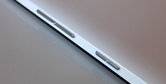
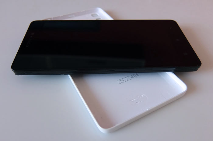
The only difference between the three is the rear cover, which also houses the volume rocker and power button. In other words, you should be able to get a replacement cover in case you damage it, or if you just want to try out a different colour. We think Lenovo missed out on an opportunity here – the company could have rolled out a lot more colour options (think Nokia or Motorola).
As for the physical dimensions, the K3 Note is an average phablet. It measures 152 x 76 x 7.9mm, but thanks to the simple, polycarbonate and plastic construction, it weighs just 145g. This doesn’t sound very impressive until you factor in the user-replaceable 3000mAh battery.
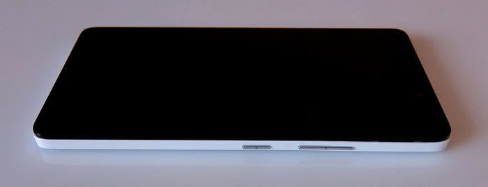
At this point you are probably starting to suspect there is a catch, and that the build quality is subpar, or that something else is missing. Granted, the build is not as good as on phablets with plastic unibody designs, or metal frames, but it’s still pretty good. There is virtually no flex and the rear cover offers a snug fit. It doesn’t creak on the rear, or on the sides. However, the top and the bottom can flex a bit, and sound off in the process. Luckily, nobody is likely to grip their phone in such a way, so it’s not a big deal.
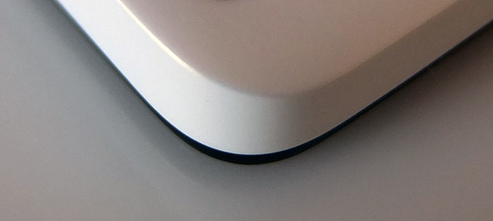
The matte finish on the polycarbonate back feels good and stands up to fingerprints and grease. It will obviously handle small scuffs and scratches better than glossy back covers on many similarly priced phones. It also offers a decent amount of grip.
The 1080p panel is protected by a pane of AGC Dragontrail glass, but that’s not all. The plastic bezels are not flush with the screen, so they offer some additional protection as well.
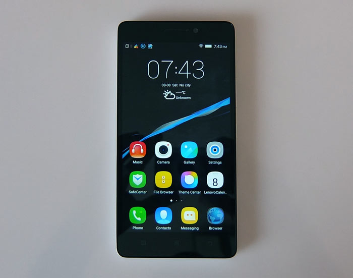
The layout is more or less standard – volume rocker and power button on the right, USB and audio connectors on the top.
Since the back cover is removable, no card slots are visible from the outside. Overall, the design is not bad, although it’s not head-turning. Like we said, it’s utilitarian, so the focus is on practicality and value, rather than the “wow” factor.
There is nothing wrong with that, at least not in this market segment. This phone is designed for people who are after good performance on a budget, for people who just want a straightforward workhorse rather than a flashy fashion accessory.


